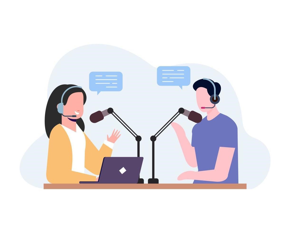
Over the last couple of years, hybrid conferences, podcasts, and webinars have grown exponentially. “Reach” is a startup trying to capture the market by developing an online market for speakers.
1. Speakers can browse for opportunities that connect with their knowledge.
2. Hosts and organizers can engage with speakers for collaboration.
2 Months Jan 2022 – July 2022 Master’s Project Subject- UX Foundation
Problem Statement
The current process for speakers to identify and engage with suitable speaking opportunities and hosts is inefficient and burdensome, often requiring extensive manual research, networking, and communication. This results in wasted time and resources for both speakers and event hosts, hindering the optimal utilization of knowledge-sharing platforms.
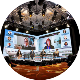
Market Study
The COVID-19 pandemic accelerated the rise of virtual speaking, and this trend is here to stay, in 2024.
Many businesses and organizations are looking for speakers who can provide unique and valuable insights on a wide range of topics.
Hybrid events combine both virtual and in-person elements. This type of event is becoming increasingly popular, as it offers the best of both worlds.
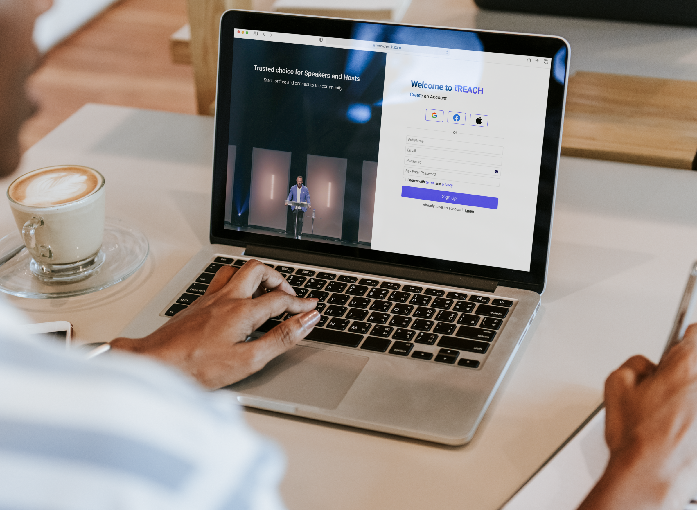
Solution
Reach Platform- responsive web app that helps speakers find an opportunity of their interest and connect with the hosts.
How Might we..
Enable speakers to find opportunities and connect them to the hosts of their knowledge while making the process less time-consuming and cumbersome?
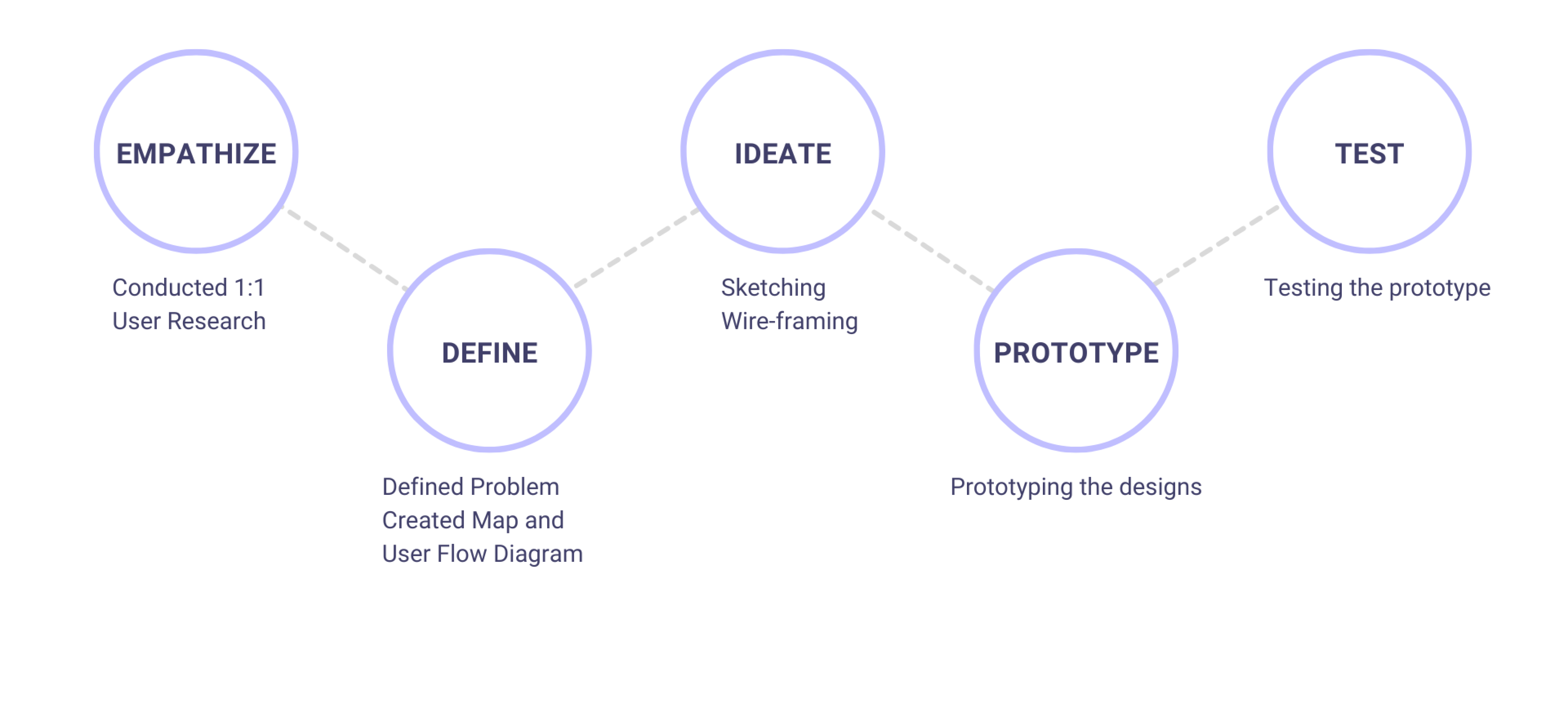
Design Process
Understanding the User
I interviewed a total of six users – three from speaking and three from host backgrounds from the age range of 20-50 years. Here are few user problems from the interview:
1
It is difficult to connect to various hosts to find if there are any available speaking opportunities of interest. Sometimes after connecting there are no upcoming Events.
2
It is difficult to pitch different ideas to the hosts and event organizers to get the job.
3
Users are pitching to multiple people but not hearing back from them.
4
Sometimes there are scam events and hence need to be extra careful.
Qualitative Research Insights & Report
User Flow Diagram
Lo-Fidelity Wireframes
I sketched out wireframes using the Crazy 8 method. After multiple sessions, I picked the designs that I felt addressed the goals the best and then digitalized them.
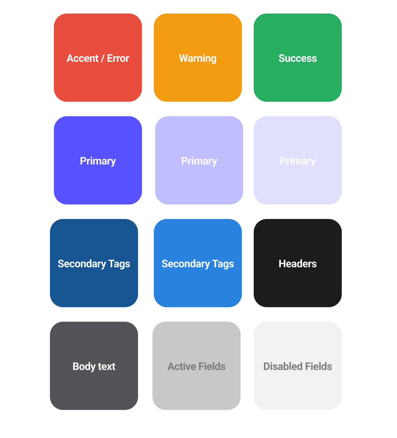
Branding
Colors
Reach uses calm, muted colors to help relax the user. Finding opportunities for speakers, and finding speakers for hosts can be stressful. The colors help bring a sense of :
Ambition
Ease
Calm
Font
Roboto font has a curve that seems friendly at the same time brings clarity.
Headline H1-36- Bold
Headline H2- 30- Bold
Headline H3 -22- Medium
Headline H4 -20- Medium
Body text -16- Regular
Small text -14- Regular
Usability test - Feedback loop
Before..
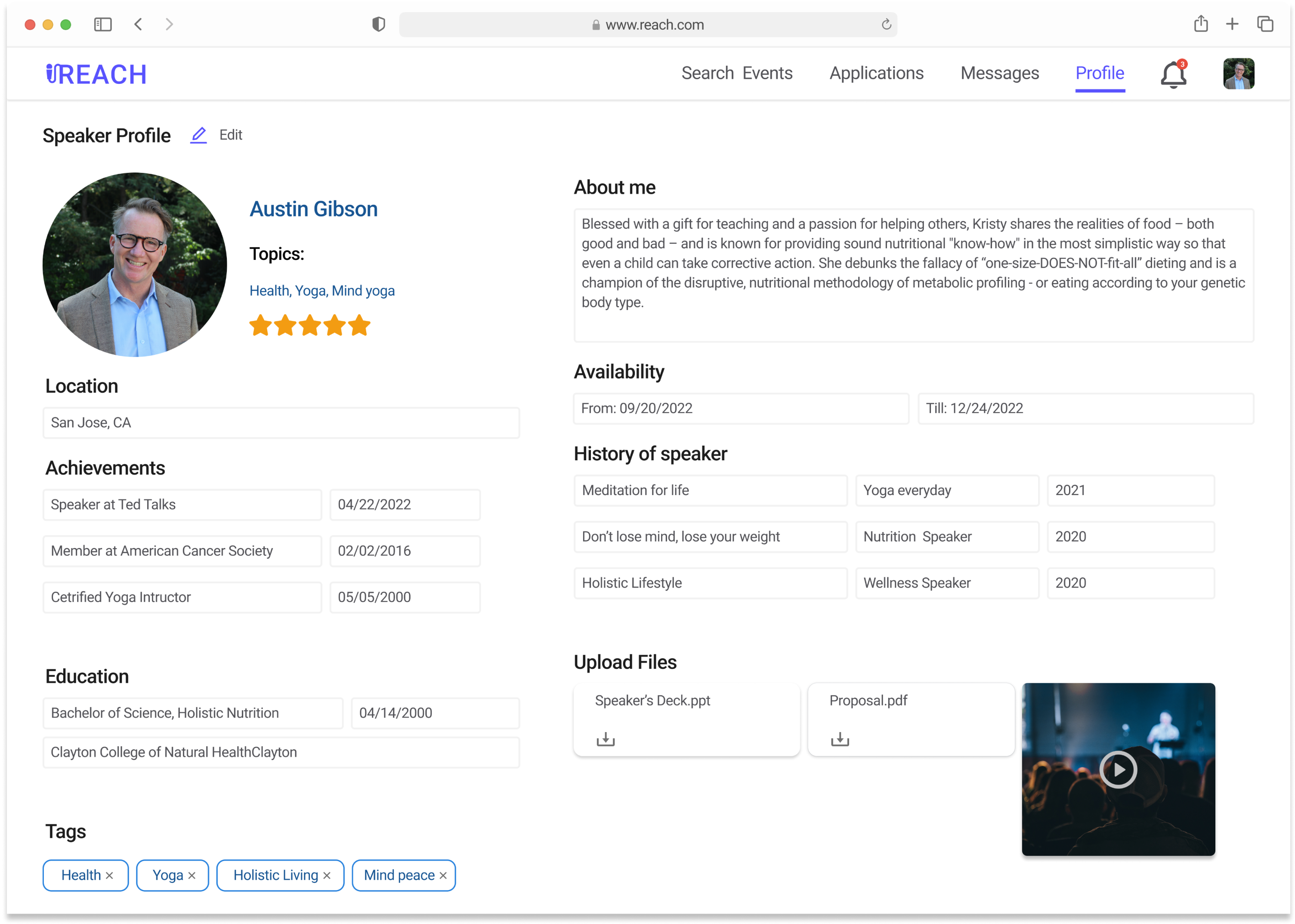
Positive
Users like how the profile page looked like. It had relevant information and was able view all information at one glance.
Constructive
Users felt that the deactivated fields looked editable even when viewing the profile page. They felt edit button was difficult to find.
I was trying to click the fields to edit them because they looked editable when deactivated.
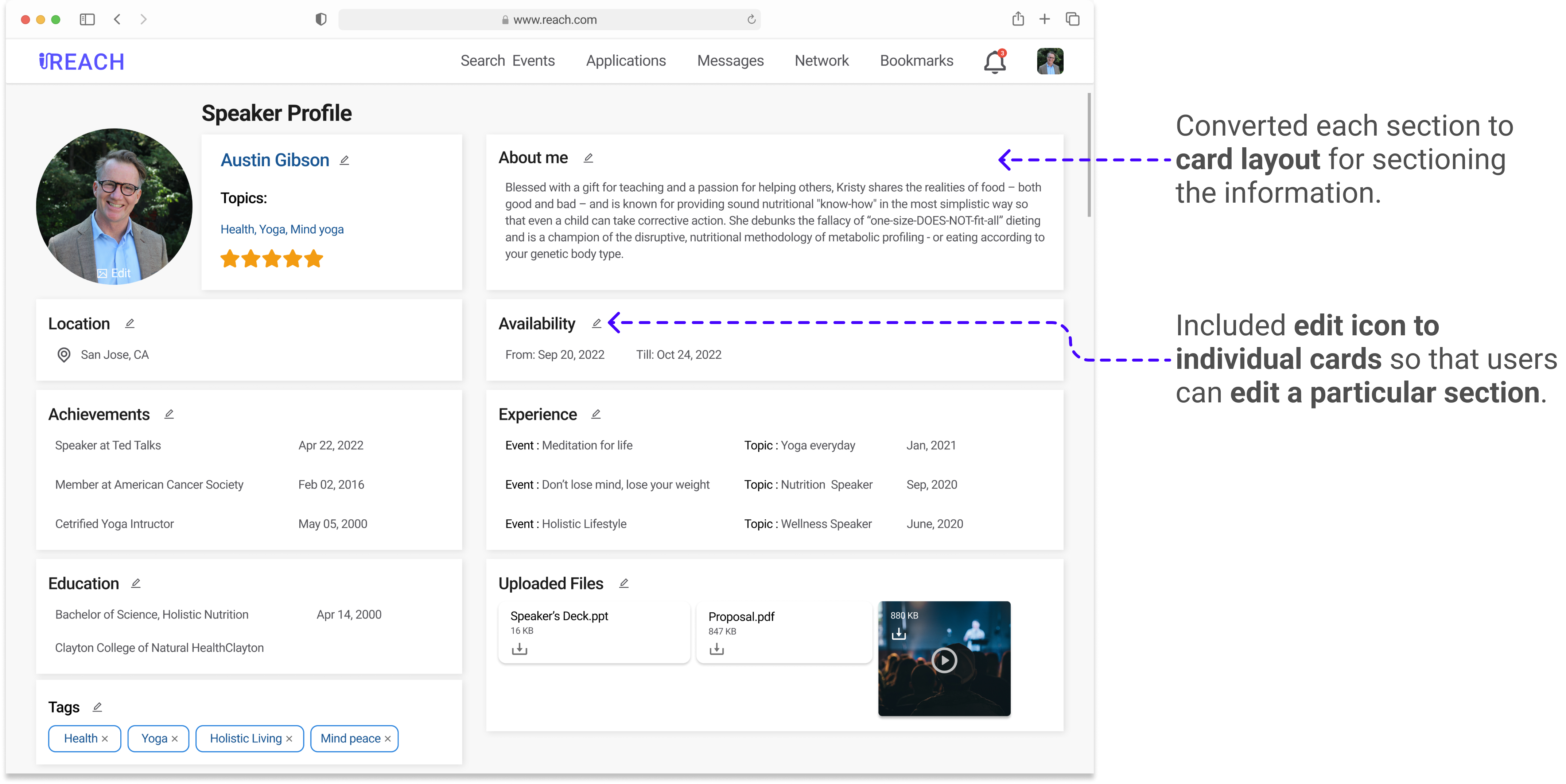
After...
Before...
Positive
Users felt that the filters were intuitive and designed good. They liked that there was a variety of filters too.
Constructive
Users felt that when using the tags to filter- the UI could display the tags.
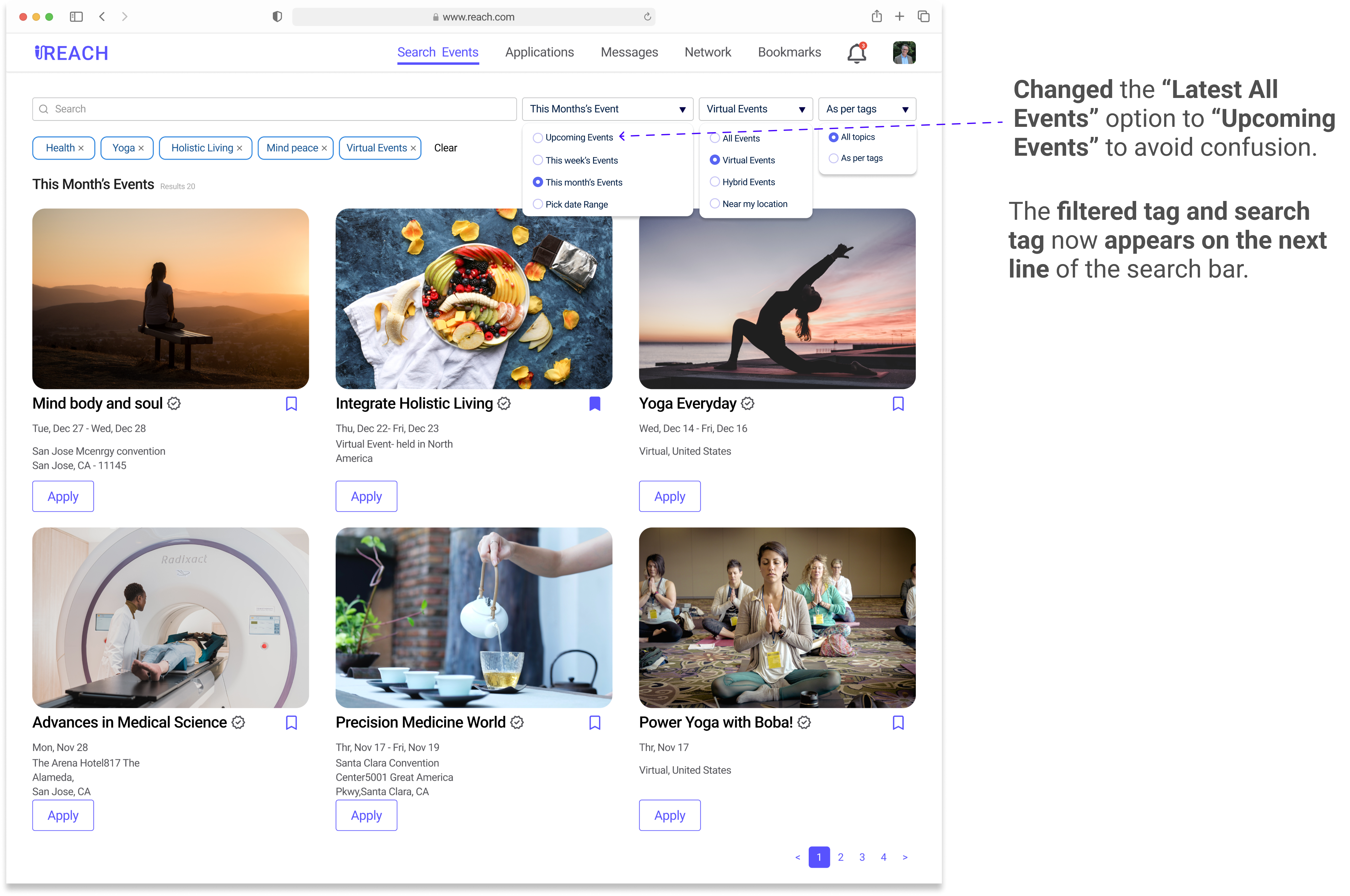
Users were confused about the “Latest Events” filter since it did not mention what time range it was going to filter, and also looked similar to the “All Events” filter.
When selecting the tags in the filter, it just displays the results. I do not see what tags were used for filtering the results.
After...
Final Screens
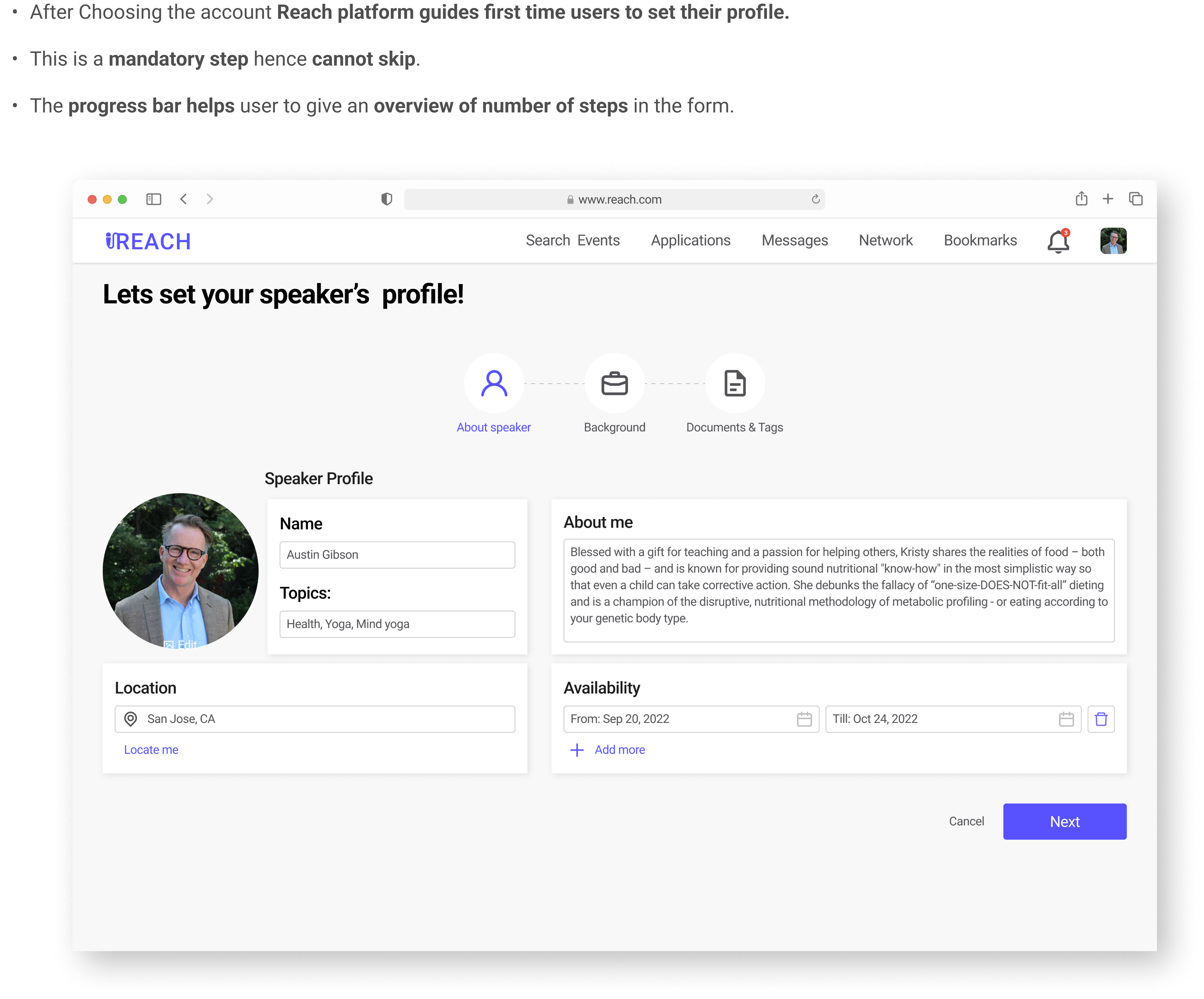
Setting User Profile - first time user
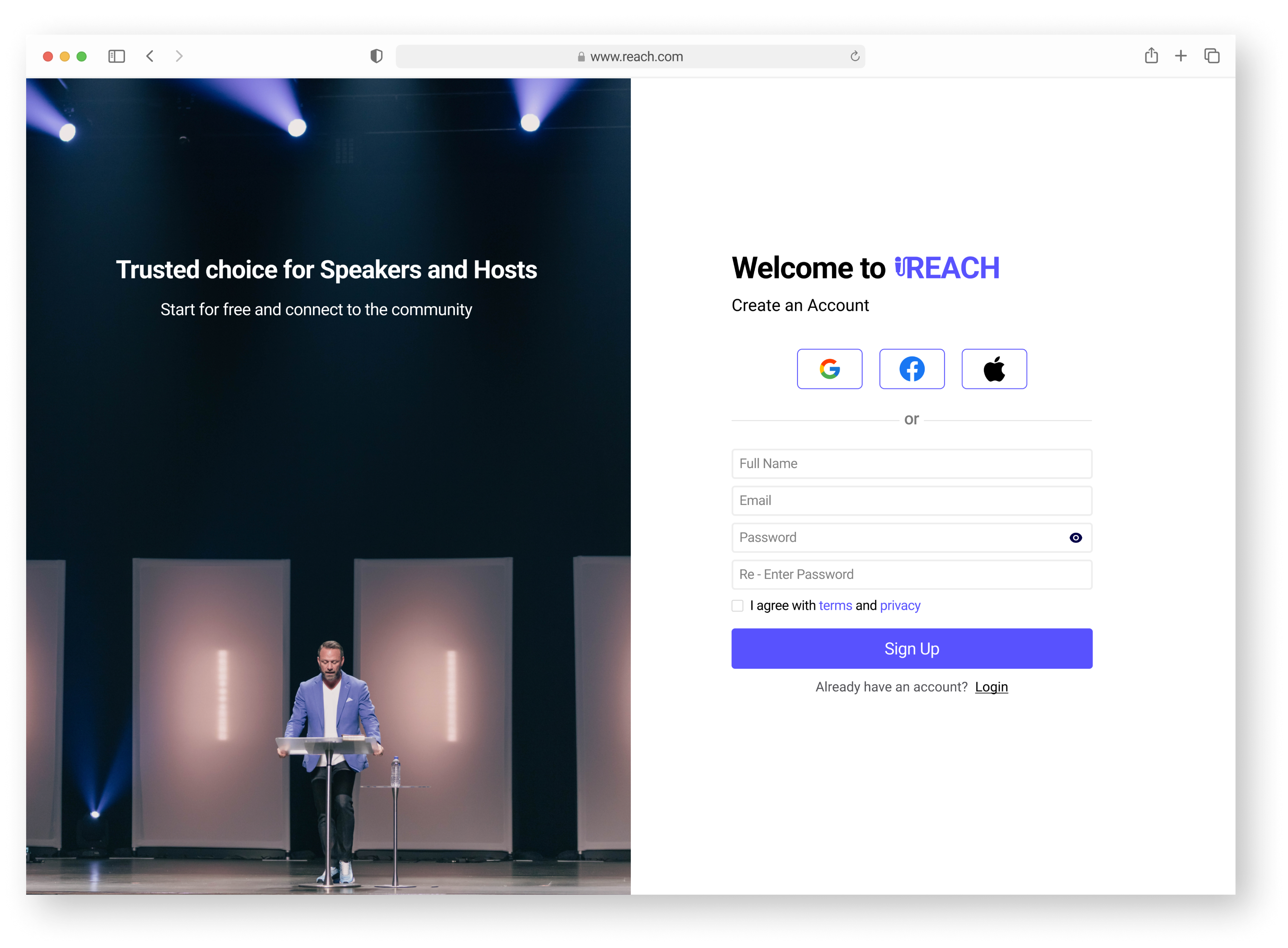
The users also requested Sign-in with Google, Apple, and Facebook – since it saves time and effort signing up.
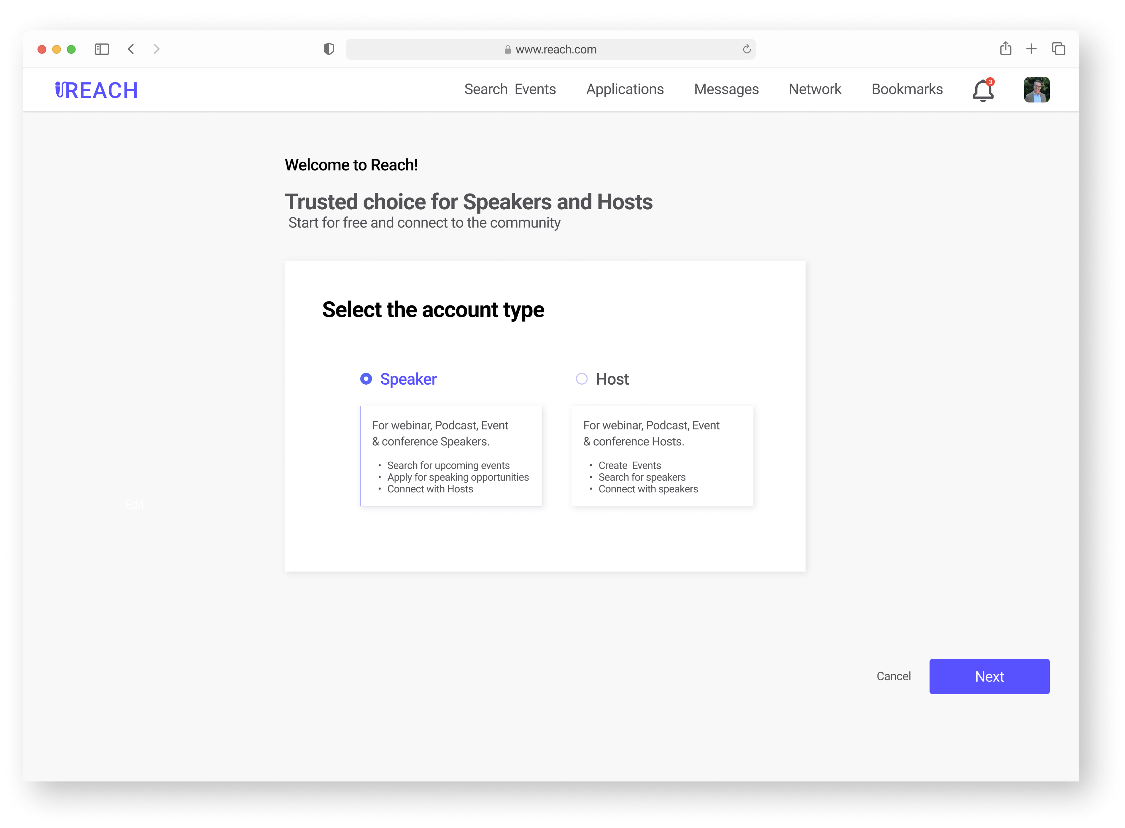
After signing up, Users can choose which profile they want to create.
Setting User Profile - first time user
After setting the profile, users are notified that they have created the profile with a celebration pop-up.
They can now search for events by clicking on the “Search Events” button.
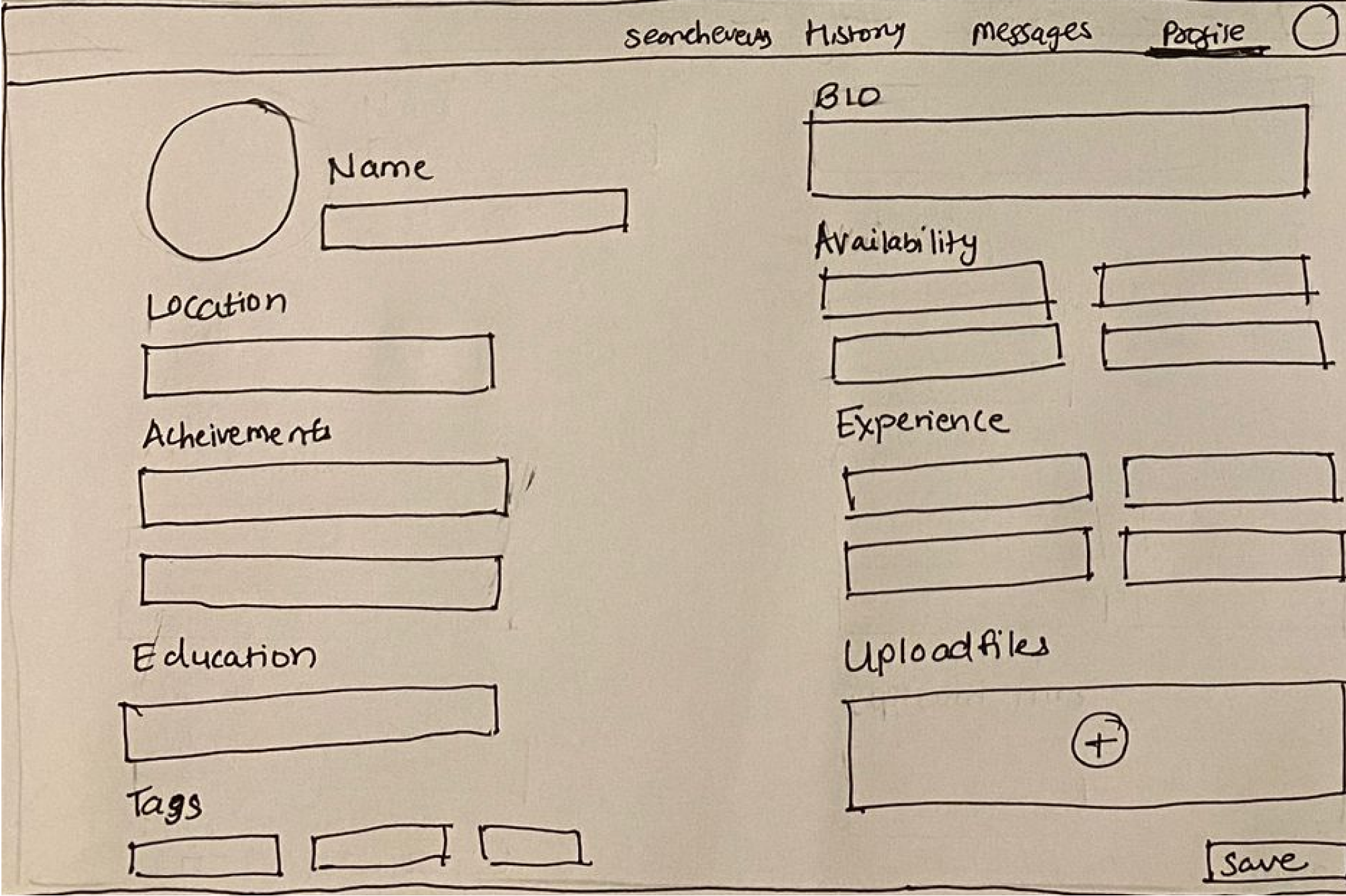
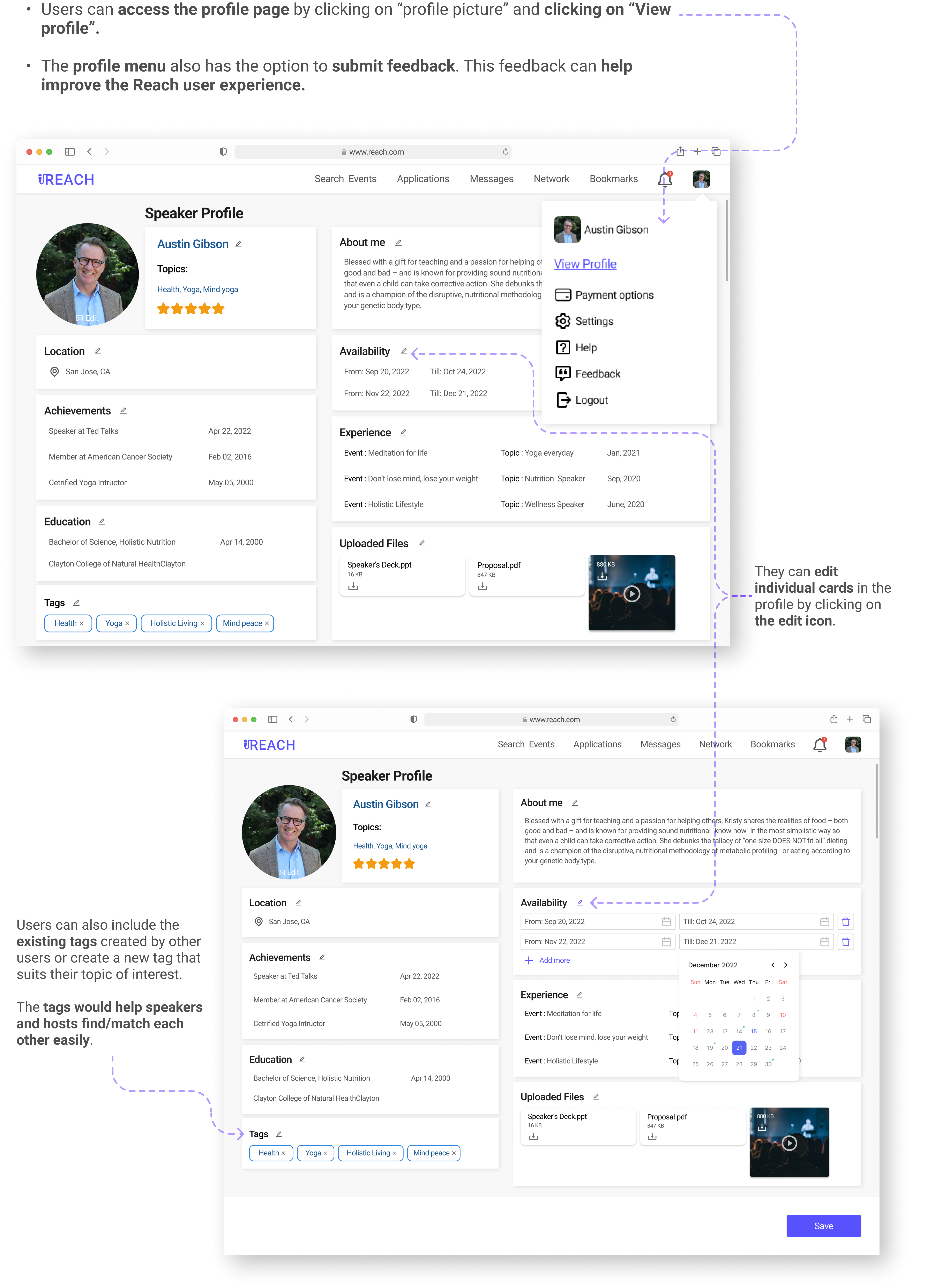
Viewing the set profile and Edits
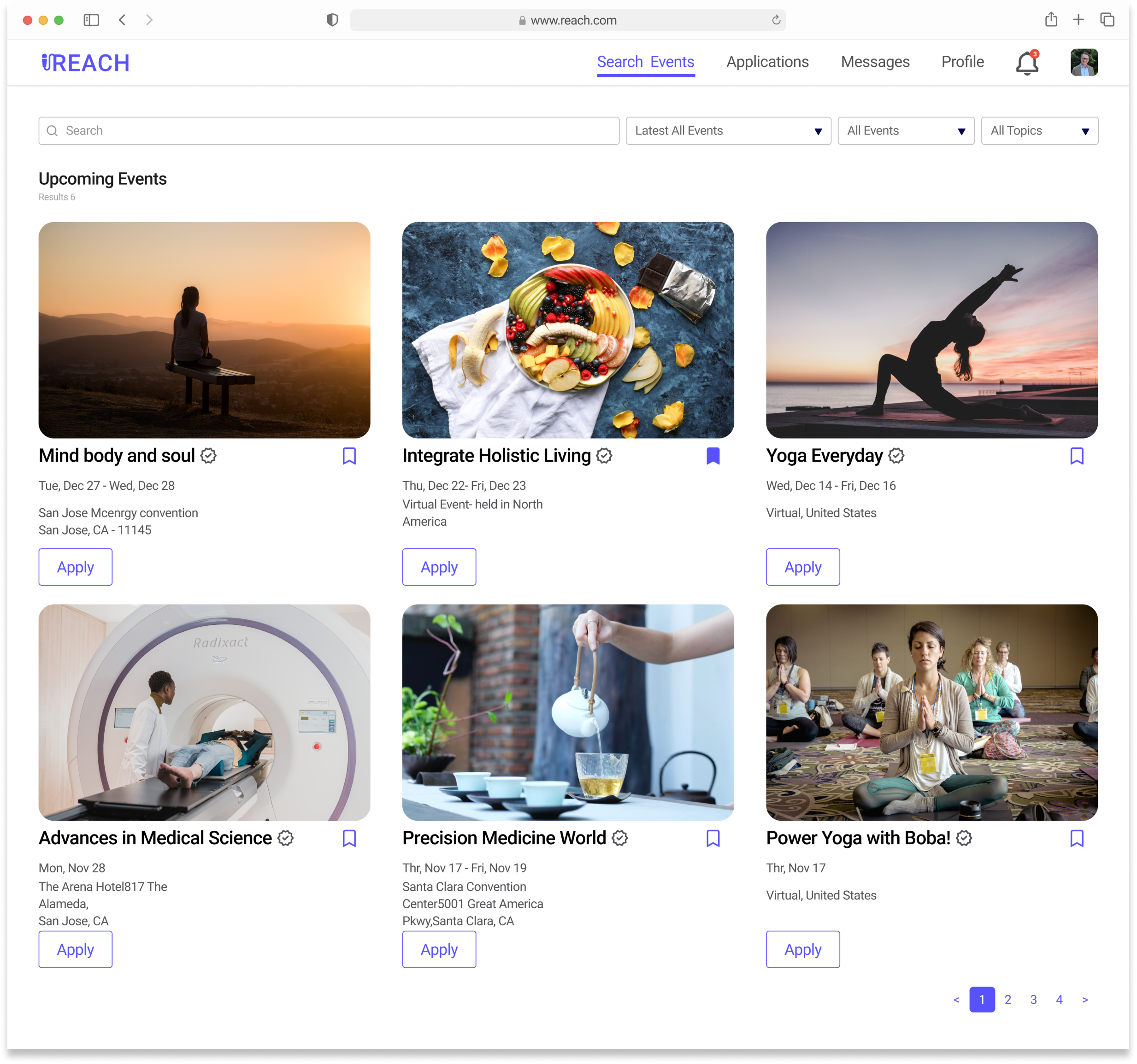
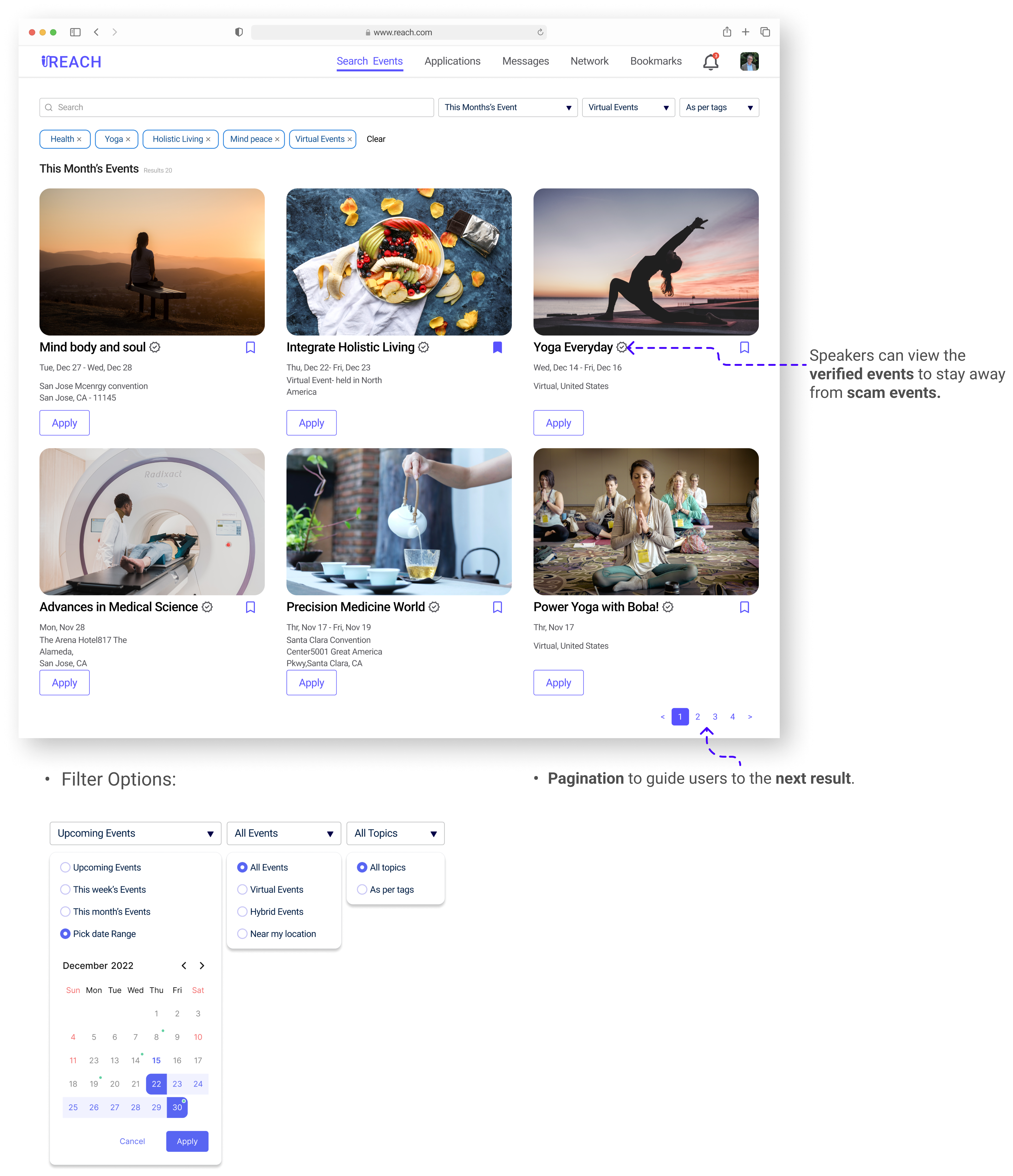
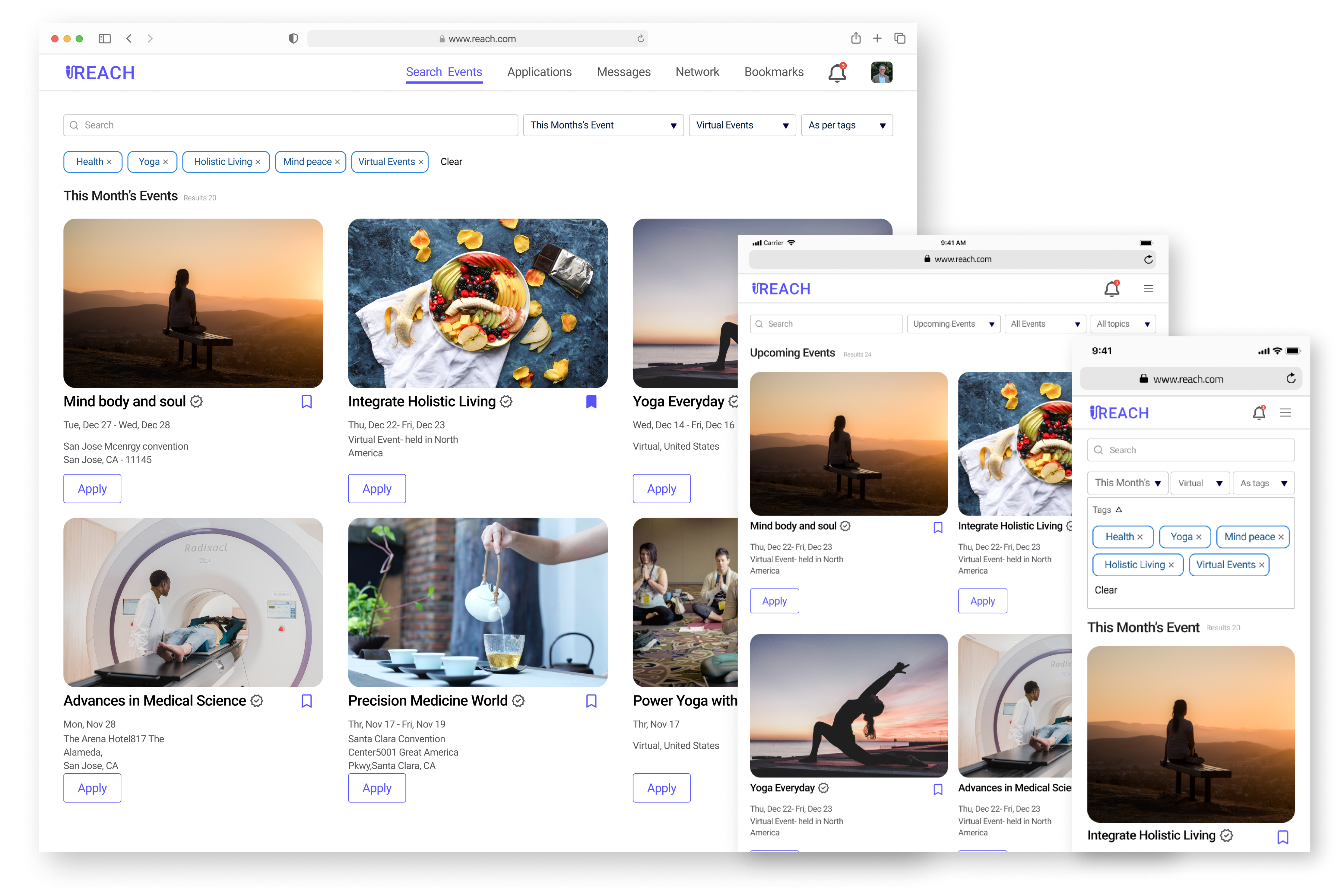
Search an event
Users can search for events and apply filters while searching.
The search and filter tags appear on the next line of the search bar.
They can remove any unwanted tags.
Users can apply to multiple events and reach their host to find the opportunity efficiently.
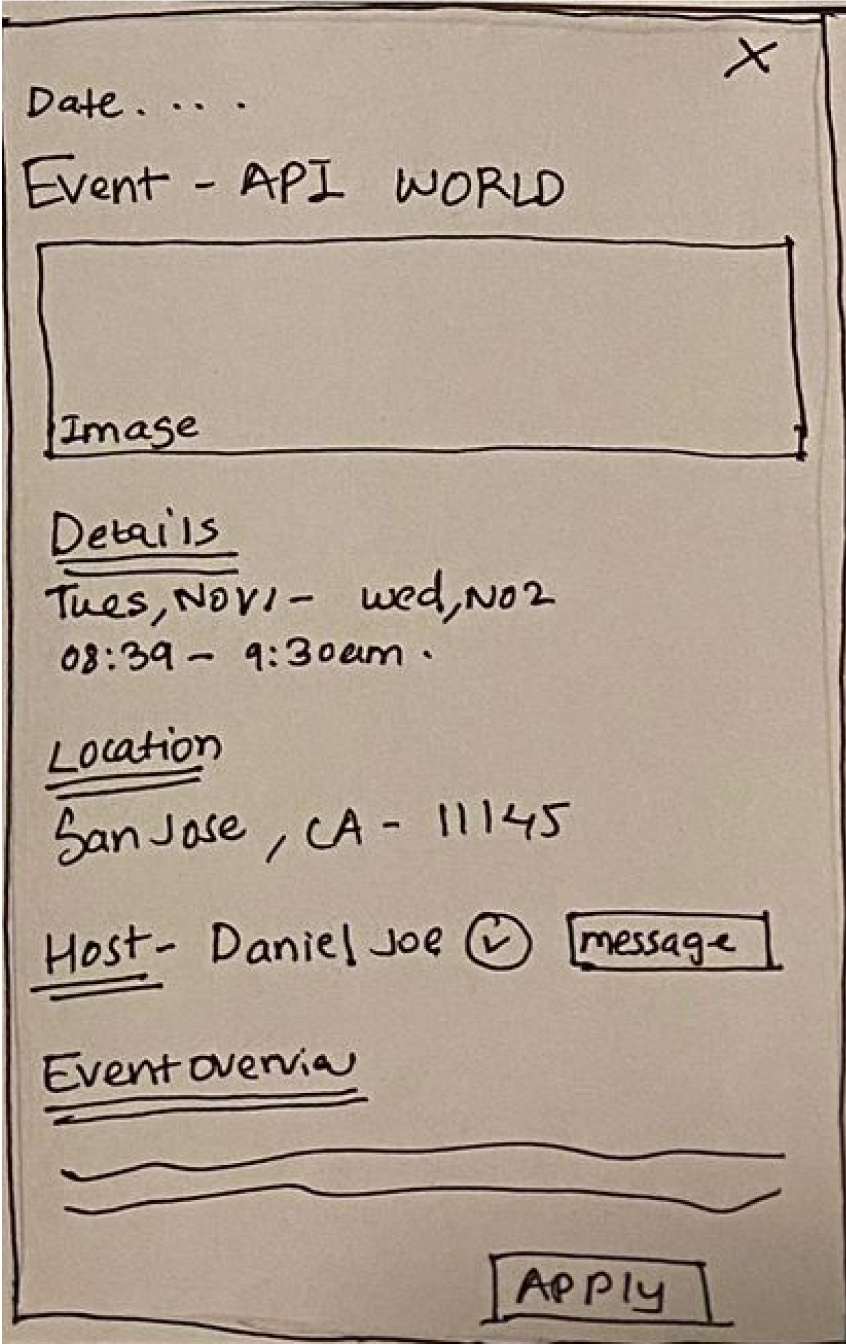
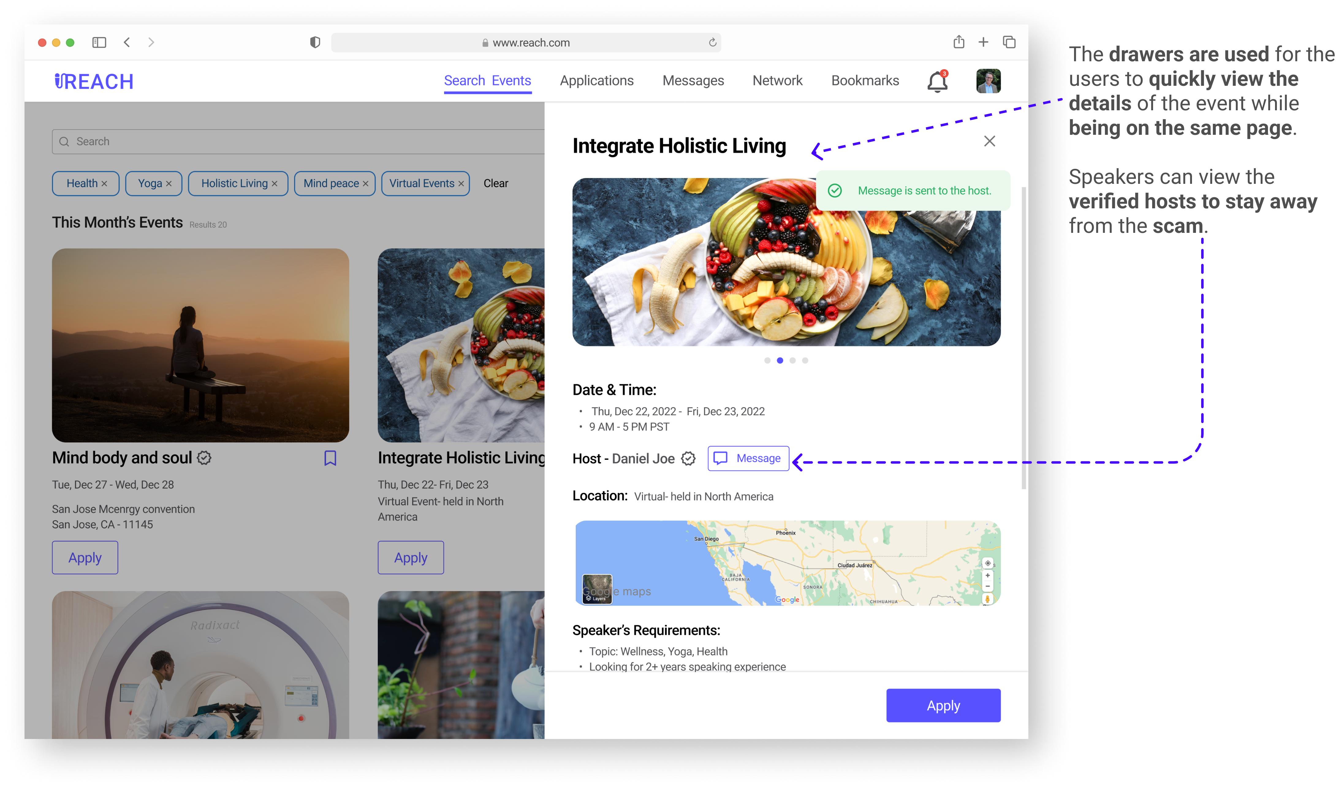
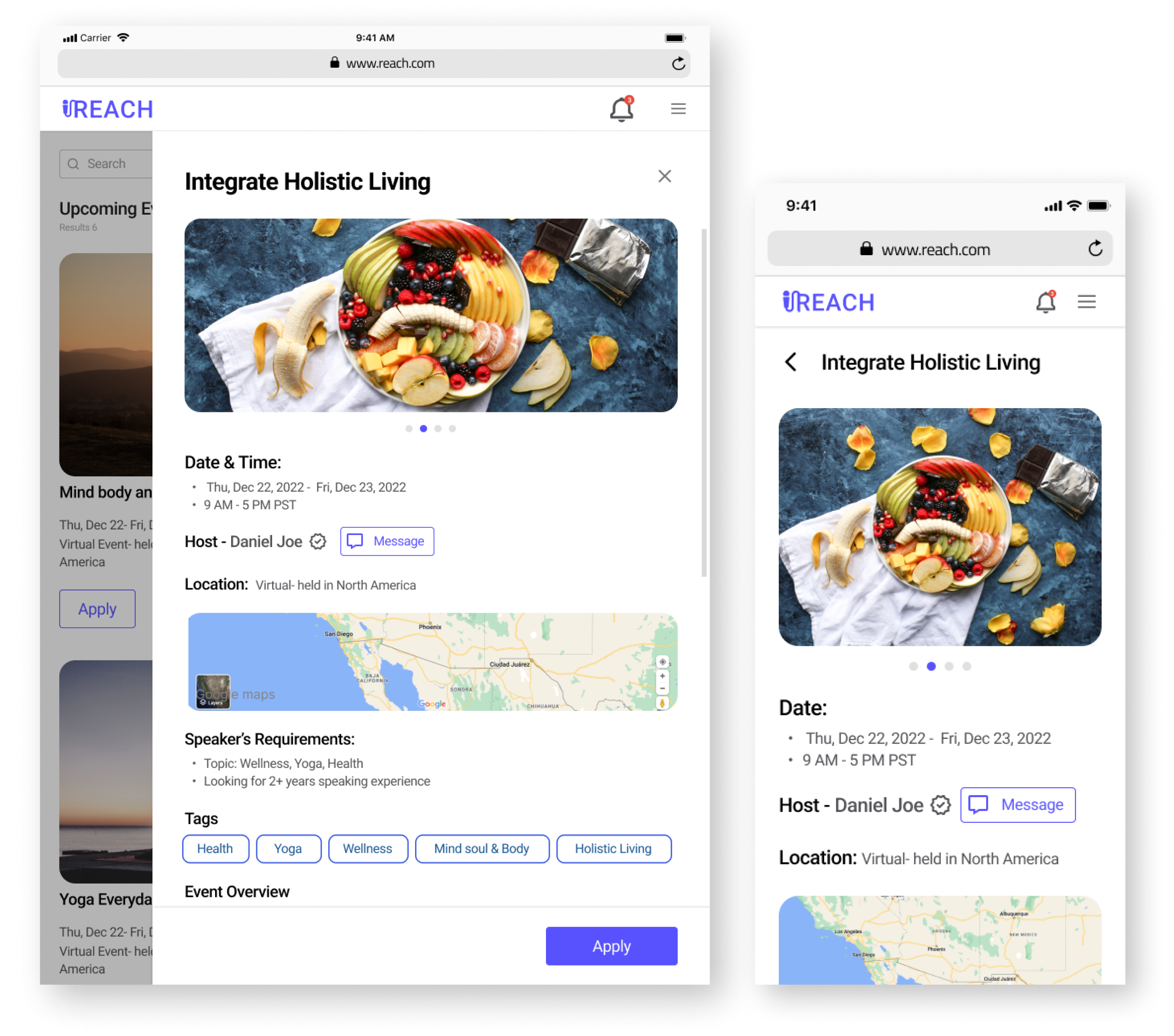
View an Event
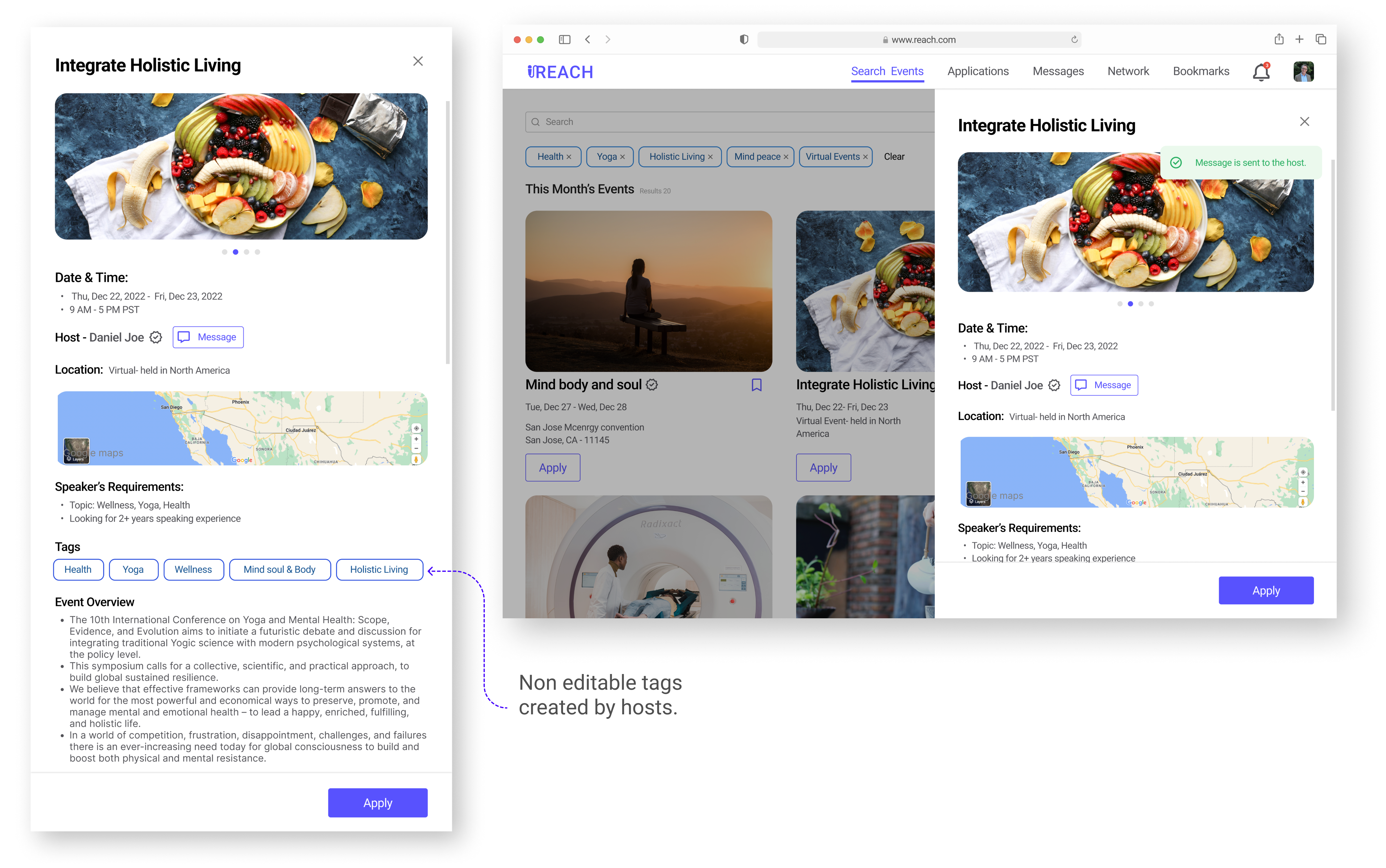
Drawer View
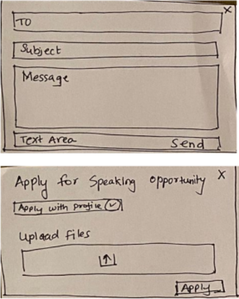
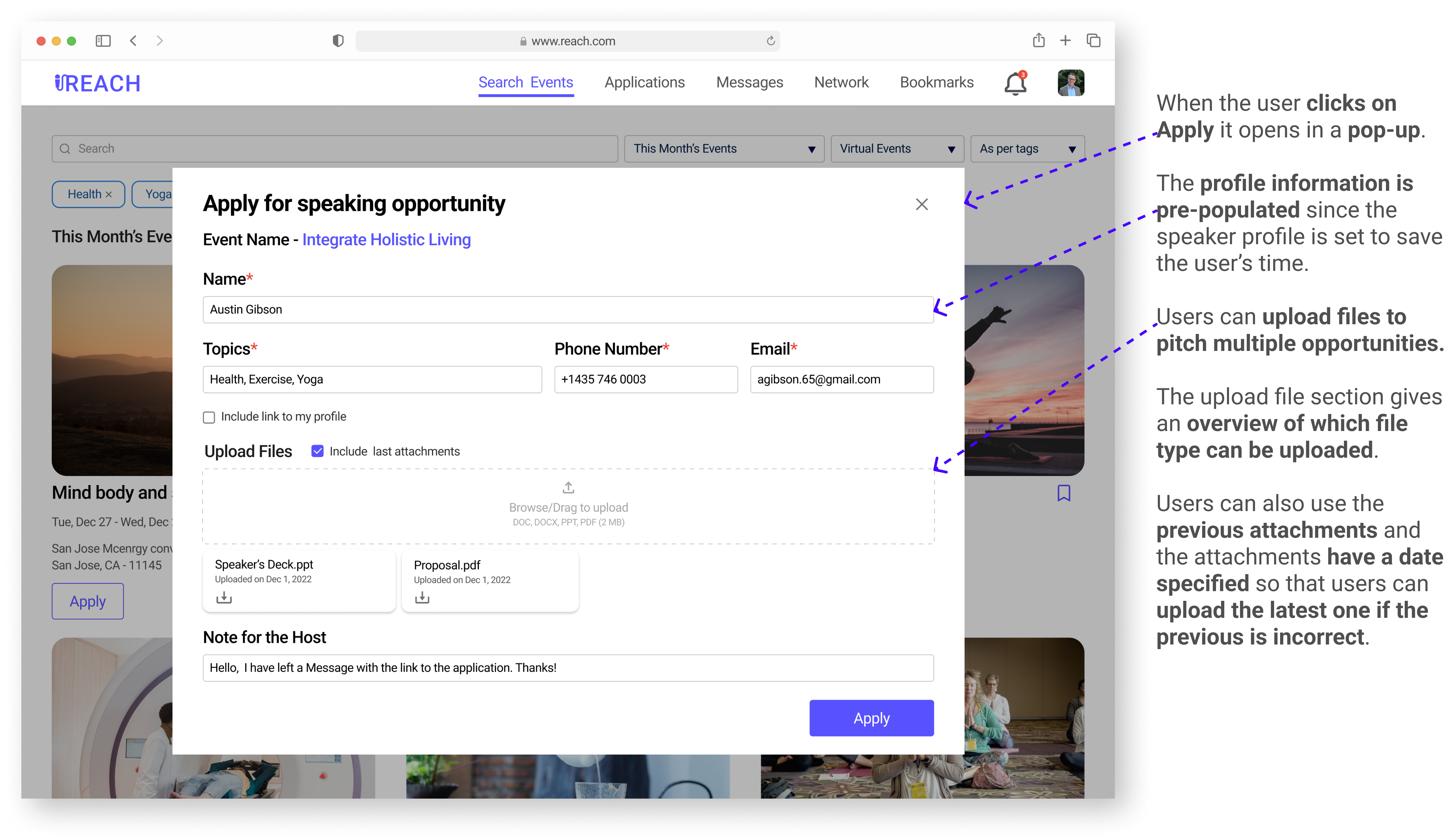
Apply to the Event
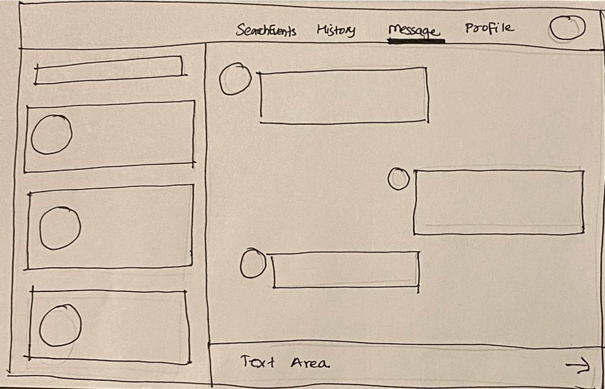
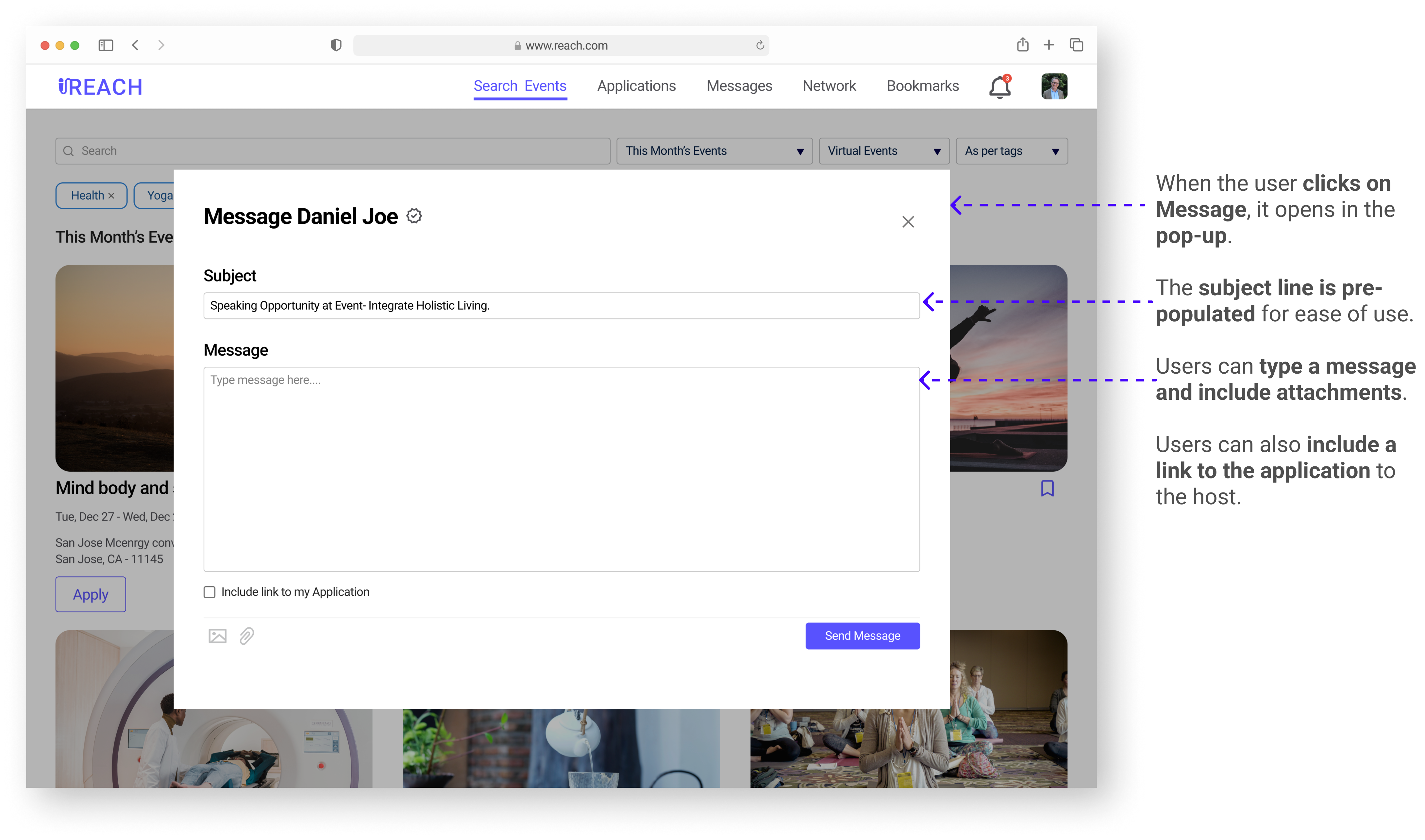
Message the host
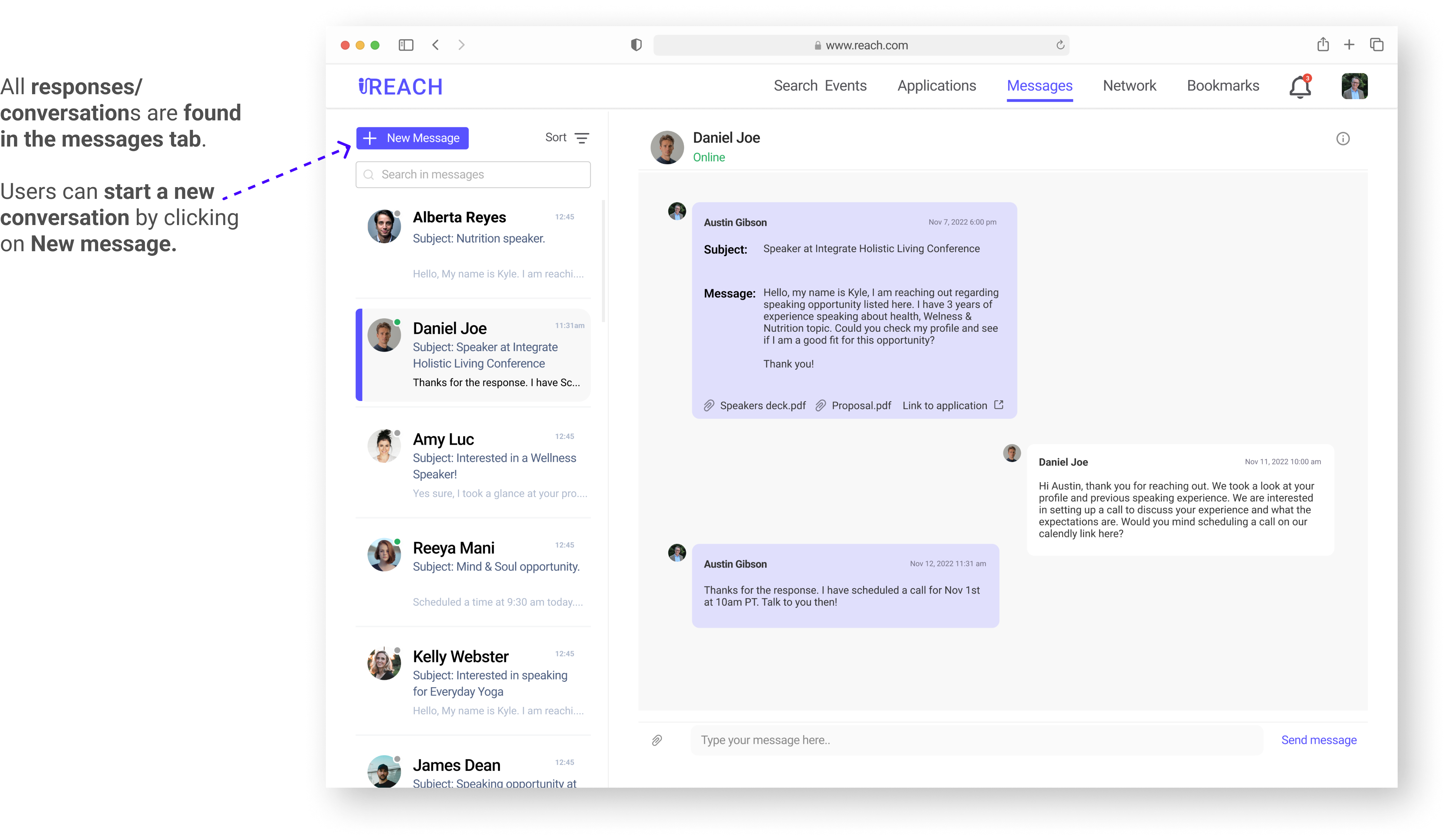
Response from the host
Responsive Designs
What I Learned
To craft a story from research to design
When there aren’t too many similar existing apps in the marketplace, users can find it difficult to navigate through the app. A nice clean and minimal layout can help users get accustomed to the app easily. Also keeping the steps required to accomplish certain tasks helps make the app more user friendly.
About different elements of the design by gathering inspiration
One of my main motives while designing the app was to make every flow seamless and also make it easy for users to search and filter events. To help build this, I learned about different elements used in design such as tags, filters, popups, and drawers by gathering inspiration.
Feedback session from the class made me think of latest news
When working on adding verification to filter scam events, I had originally thought of adding a blue verified tick. I received feedback that maybe I should reconsider the blue tick since it was in the news due to Twitter’s policy changes. I took a look and read how the blue tick was being viewed negatively. Based on that I decided to change it from a blue tick to a black tick.
Next Steps
We have added feedback to track metrics like ease of use and different ratings for features.
In the survey for feedback, we plan to track certain metrics like ease-of-use, how much would users rate certain features like search, profile, messages etc. With enough responses, we hope to use this for tracking success. Using the feedback, we can iterate and improve the Reach user experience, and we can also measure ratings improvements after the changes in the UI.
Moving forward, various additional features can be explored in the later stages.
For example, we can add options to allow users to network with each other by sending connection requests, display payment options on speaker profiles, add options for payment gateways to help speakers receive payment via the app etc.
Synchronizing the events and tasks with google calendars.
Integrate with different applications like Zoom for virtual events/meetings.